Wednesday 11 December 2013

Final Design for Web Crit

Our final web crit followed the same structure as our final print crit. We were dived into groups A & B. We placed our work out onto the table in order for the other group to anonymously form constructive responses to our work and ideas so far. As part of this exercise we were also encouraged to ask specific questions which we wanted feedback on. As my content was not finished and I had only achieved a very basic website structure so far, I directed my questions more towards the aesthetic elements such as type, navigation and colour.

Alongside my current website which was still a work in progress, I placed a range of scamps and thumbnails on the table for my peers to have a look at. This was to gather feedback on other possible layout preferences. Some of these scamps are shown below:


My three questions:
1. Do the buttons work with my concept, or are they too big/too fancy?
2. Is the navigation appropriate? Would another layout be better?
3. At the moment, my website is plain black and white, however I am intending to include vibrant and bold colour. What colour scheme do you think would work best?

The responses I received were all clear and constructive. This really helped to decide how I wanted to develop my website from this point.


My feedback:

  • I think that your buttons would probably benefit being smaller as at the moment they appear more like titles on a page due to their size.
  • keep the navigation where it is! It's very easy to navigate around which is what any user on any website would want. Let the art be the unusual thing.
  • Colours of Morocco? Try finding a Moroccan colour palette and colour picking colours from there for authenticity - and then translating these into the nearest web-safe colours you can find?
  • I don't think you need the line down the centre of the page. It is easy to see that the page is split into two columns without using this. The line also splits your navigation bar in half, with no reason.
  • I would also maybe choose sans serif fonts for your buttons/ body copy. This would allow for these elements to support your images of Moroccan art without trying to take away from them. In simpler terms, let the art be the only ornate things on each page, so that these stand out.

  • I think it works. Although the buttons are big, they are still simple and break the page up. I like the way the lines appear on the top and bottom of the buttons also.
  • I like the navigation where it is. Your thumbnail number 3 looks really good too, although I don't know how easy that would be to code.
  • Have a look at design.seeds.com for help with your colour. I think beige and red when I think of Moroccan.

  • I think you have done a good job so far regarding getting used to the coding process. I agree that number 3 on your proposed thumbnails would work very well aesthetically. 
  • Perhaps adding in vivid photographs of this art, from mosques and tiles etc, would help to make the pages pop as well as digitally rendered examples for explanation.
  • Photoshop your images to make them more vivid and save them as png's - (could be used as background images).
  • I think the type used in the navigation bar is not bad, however, using something more minimal and modern may help gain interest. (dafont.com is good for type) -- Keep it up!

  • In a word, yes! Maybe widen the spacing between the letters and make them smaller for a more contemporary look.
  • It's more functional where it is but I really love the centralised design you've drawn - I would go with that!
  • Pick colours from your research - (peach, gold, turquoise, brown) it might be nice just to use these as a background colour and keep the text black?
  • Try a different typeface for your body copy - go onto GoogleFonts -- they're all web safe and have instructions on how to install.

  • Who would the user be contacting? Is this suitable?


Tuesday 3 December 2013

OUGD504: Design For Print Final Crit

The format of this crit was slightly different to our previous crits. We were divided into two separate groups (A&B). We were asked to give anonymous feedback to the other group's work while they took a break then vice versa. This was a useful way to gather honest feedback from our peers. We were encouraged to write down questions to be answered about our own work. My four questions were:

1. Would this publication be useful?
2. Is the concept clear?
3. Does the acrylic work as a front&back cover or should I use a different stock?
4. Should I include a glossary at the back with extra print information and resources or leave it as it is?


From this, I received a large amount of positive and constructive feedback…

  • The use of acrylic stock for the cover is an interesting idea, it will make the outcome much heavier but improve durability.
  • I think it's a strong concept. The use of print-related quotes is a really relevant and engaging way of displaying the different print examples.
  • The cover stock is well applied, although it's heavy, it is aesthetically interesting, grabs audience attention and improves durability.
  • The content is well laid out, you can see where your grids would sit.
  • The pages are balanced, there is always a good amount of negative space and visuals - this helps with the flow of your book.
  • The majority of points I can think of have all been well documented, however, I would still include a glossary, it could be used as a quick 'term' reference guide for your audience.
  • (On a personal note) I have never been a fan of ring bound outcomes since the one on my diary in school broke and stabbed me. What other binding methods are available?
  • This publication would be useful, not only as an information pack, but it is also very bespoke.
  • It is unclear who your audience is, however the ideas are really innovative.
  • Definitely use the acrylic stock. It's durable and different from other books.
  • Ring bind it to keep the pages together.
  • Love the use of quotes to illustrate your processes - it works really well with your concept.
  • I think the use of black stock will be much more effective. The acrylic appears cheap and tacky, whereas on stock it appears much more high end. 
  • Adding more content such as a glossary may not fit with the rest of the content.
  • The publication would be useful as a general overview of print in design. Perhaps beginners.
  • The acrylic cover is a unique addition and the bright colour of the cut adds a fun, modern aesthetic. 
  • Are you going to carry this fluorescent orange throughout the publication? I think this could benefit as it would make it more consistent. 
  • If the concept is to give a general design for print overview then it is clear. Not sure if there is a deeper concept?
  • I feel the book has a large amount of content/ info and you could easily overwhelm your audience so I wouldn't add any more content.
  • The production would be useful for somebody with an underlying interest in print, not necessarily an enthusiast. Or even a newcomer in the design industry.
  • The opening paragraph on audience is a great introduction to the publication and gives a well written insight into print. This sets the tone of voice well for the rest of it.
  • You could maybe go into more detail on some of the print processes or visually represent these.
  • Intelligent use of quotes to link and relate to the subject at hand but maybe reconsider the positioning of the person's name?
  • The use of acrylic as a front and back cover is a wonderful idea. It provides protection for the stock when closed, easy to clean and also draws attention due to the bright vivid colours.
  • By ring binding the book it adds a further element of functionality as it can lay flat and doesn't require constant attention.
  • A glossary would be an added bonus as it would allow to have a brief summary of terms without routing or going away to see what certain words mean.

Thursday 28 November 2013

OUGD504: Design for Print

Developing my concept.

I used InDesign to begin experimenting with different layouts for each chapter.
I wanted these to remain consistent, but each with a simple unique reference to the relevant topic.

Initially, I placed each quote into Indesign. I set the pages up next to one another to see how they worked as a series as well as working as individuals. I already knew I wanted to work in A3 format so I used this for my page setup.

I kept the design as basic as possible to begin with. Instead I focused on the layout, positioning and structure of the series of quotes. Initially, I worked in Helvetica and Arial. These were appropriate as they are both clear and bold typefaces with a wide range of weights to experiment with.


In order to help me get a better understanding of the layout and structure of my publication, I wrote down a list compromising of the key elements I needed to take into consideration. This was a useful way to consider how each page would work visually. By doing this, I was able to think about each page individually and list each material and print process needed specifically for each page. 


Materials I need:
  • Acrylic plastic
  • Accetate
  • Tracing paper
  • Reflective plastic/paper
  • Ordinary paper/card
  • Black card - otional for experimentation.
  • Material for box packaging/ bag packaging - unlikely and would be considered last depending on time.

I then placed all of the pages into an Illustrator document as small thumbnails. I printed this out as a visual reference. It was also a useful way to compare my chapter pages against one another.
I printed the thumbnail versions out onto A4 and wrote notes underneath each page to help plan my time effectively.


I began developing my chapter page designs in InDesign. Previously, I had just been working in Arial. I wanted to find a different typeface which worked more effectively with me concept. I thought it would be most appropriate to use a bold and capitalised typeface for the chapter pages. This was important as the chapter pages were the core element holding my concept together. 

A few typefaces I considered included:

Arial
Although this is highly legible, I found arial plain, boring and dull. It was a good typeface to begin my development, however not ideal for the bold and inspiring approach I wanted to take with my publication.

Comfortaa
Comfortaa is a more unusual typeface, however it is only available in this weight which I thought seemed too unevenly spaced. 

Arial Bold
Arial Bold capitalised was closer to what I was looking for. Although it still seemed slightly boring and over-used. 

American Typewriter Regular
American Typewriter gave the quote a completely different feel. Although I think it works quite nicely, it seemed a bit too traditional. 
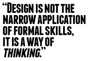
Franchise
Franchise had the ideal look for my publication quotes. It is modern, bold and more stylish than the commonly used sans-serif typefaces such as Arial and Helvetica.

___________


Once I was decided on the fonts and styles I wanted to work with, I began applying these to my publication in Indesign alongside mockup pages of content. The screenshots below show each page. These do not use my own content, they were put together using other web sources as a layout example for my peers to review in our final design for print crit….

Pages 1&2


Pages 3&4

Pages 5&6

PAges 7&8

Pages 9&10

Pages 11&12

Pages 13&14

Pages 16&17

Page 18
Although in this InDesign version, the entire publication is presented in black and white, I had plans to use a range of stocks and processes. The general stock for the chapter content was to also be printed on slightly textured off-white paper stock - either watercolour or antique paper.

______


As I was aiming to work with a range of printing methods, I needed to consider both types of silk-screens. I exposed my quotes on to a fabric screen first. This was going to be used for my flocking, foiling and heat-reactive printing. I also exposed the quotes onto a paper screen in order to screen-print the remaining quotes. I decided the most efficient way to do this was to fit all of the quotes together onto A1 sized screens. I was advised I would achieve the best results if I left approximately one hand space in width from the border of the screens.

Each screen was exposed individually in the UV light unit

They were then rinsed with cold water and a sponge to reveal the exposed text. 

For the fabric screen (shown below), I had to remove two of the quotes. This was because the screen was a more unusual, and smaller size. This wasn't a problem however, as I only needed a select few exposed onto this screen. 


I used washing-up liquid to degrease the screens. Once this was rinsed off, the screens were left over night to dry.

For my first attempt at foiling and flocking, I bought a small selection of samples and mediums. As I wasn't decided on a specific stock for these quote pages, I wanted to experiment with a variety to see which outcome was most effective.
The materials I needed were:

champagne foil
gold foil 
black velvet flocking
glue
black card
antique white paper
white card
mountboard

Firstly, I added a tiny amount of water to the glue. This was to help prevent it from blocking my screen as quickly. The glue was then applied to the fabric screen and printed using the same method as screen printing.

I was tempted to leave the glue as a print itself as it came out nicely on the black card.
The two quotes I was concentrating on at this stage were:

"…While good design is a mirror" - this was to be foiled to resemble a mirror-like reflection.
"Behavioural design is all about feeling in control. Includes usability, understanding, but also the feel" - this was to be blocked with a furry material such as felt or velvet, encouraging users to feel the texture.

Preparing the heat press for flocking and foiling
For the best results, it was crucial to allow for the glue to dry, and ensure the heat press was set up correctly.

Foiling: heat - 160degrees for 12seconds
Flocking: heat - 170degrees for 10seconds

Once the heat press was set up correctly, I began applying my materials to the glue. My first experimentations were using foiling.


Next was the flocking


I liked the imprint left in the flocking material after the process was complete. Its not like anything I've seen before. I also liked the three-dimensional element, it was a shame I couldn't incorporate this into my publication.


______


I included my own name on the last page, written in the same style as the names beneath each quote. This was to keep my publication consistent, and to also conclude the publication as my own.


After experimenting with foiling and flocking, I discovered that it was going to be difficult to successfully print the names beneath each quote. Although they were visible in some attempts, the names were not legible, and therefore did not serve any purpose. To resolve this, I decided to print the names digitally, and add the flocking, foiling, screen-print etc afterwards. In order to this, I would need to extremely careful when lining my pages up to ensure the best possible outcome. 

As this was the first time I had attempted something like this, I created two versions of my publication in InDesign: one with all the content, except the quotes - to be manually printed onto after. And another to be printed completely digitally. This would work as a back-up if my other publication were to be unsuccessful. If both publications were successful, one would work as a hard-copy, and one as a soft-copy and less valuable.. In some ways like a Teacher's and a Student's copy. 


The final outcomes are shown below (including an online Issuu version to read):


Soft-cover copy of the final publication

Digital PDF version of my publication created using issuu.com