Following on from my initial research and development on Ant's personality traits, habits and interests I began experimenting with a few of my own ideas. The main key elements I wanted to focus my type design on were Ant's bold personality, his interest in Neville Brody's work and Celtic knots as he is Irish.
I decided to experiment using existing Neville Brody typefaces. I liked quite a lot of the styles although they were quite different to one another. Above is a few sketches where I was thinking of how I wanted to incorporate the Celtic designs. I think the top typeface works best for this as I have more to work with. The bold type not only allows me to experiment with a design within the letterforms but I also feel it is most suitable for Ant's bold personality. The bottom sketches are taken from an existing Celtic knot design which I found. I wanted to see if I could find the whole alphabet within the knot. However this proved to be difficult with letters such as M, W and X.
When I was getting to know Ant, one of the main elements of graphic design as inspiration or in his own work which he is passionate about is manipulation. For example he really likes photography which has been edited on photoshop to generate something which could not be seen in reality. With this idea in mind I considered manipulation of a typeface. Using one of my favourite Neville Brody typefaces I cut each letter up (as seen above) and places them so they were slightly distorted. I liked this outcome but thought it was a bit too basic.
As i researched further into the style of Neville Brody I began to think about the nearest I could get to resemble this. I decided to look at different stencil typefaces. Above is my final choice. It is simple, yet bold and a great base type to adapt on.
From my initial sketches I chose this as my favourite design. Inspired by the Celtic knot designs I hand-drew my own interpretation. I experimented with a few variations but i think the strongest are the 2nd, 3rd and 4th examples above.
The A above was additional experimentation because I was curious to see the effect of overlapping all three of my favourite examples using the overlay filter on Photoshop. Although I really like the result, I didn't feel it would look as effective hand-drawn so decided to keep it simple.
The Final Outcome
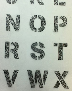
Here is my final outcome including the whole alphabet and six glyphs. Each letter has its own individual hand-drawn design. Each letterform design uses the same style. This is to keep the overall design consistent. Generally I am pleased with the result however I feel a bit disappointed that the design is not as clear and therefore less visually engaging from a distance.
Creating A Name Badge
As I felt that colour was not necessary in this particular design I wanted to keep the name badge simple yet keep the type large in order to get a clear view of the intricate design. Using tracing paper I copied the original A, N and T. I then scanned the name into Photoshop where I scaled it down to 4cm by 9cm - the required size for our badges. Below is the final outcome.


No comments:
Post a Comment