It can seem overwhelming at first but Pantone is a simple, systematic and easy way of identifying colours within design. There are different guides for different textures. For example 'Pantone Coated' is used to identify glossy material. 'Pantone Uncoated' is used for matte surfaces. Each colour has its own code. These codes are universally recognised within the design industry. This makes referencing easy and efficient when creating specific designs. In terms of shades, the Pantone guides work with percentages. The percentage represents the colour's chromatic value. The higher the value, the stronger its value.


2. Rule of Three
It is commonly argued that effective design should use no more than three typefaces at once. This is because it can become distracting and less effective. When looking at a piece of design, consistency is important. For example, if a book were to jump between typefaces it would be more difficult to read. In the same way, if a poster consists of a wide range of type choice, it appears inconsistent and clumsy.

3. Software
A good understanding of the main software is important. Each programme entitles designers to generate a different approach to their work. It could be argued that knowing one programme really well is better than knowing none at all. However there is nothing more useful than being equipt with the skills for every programme. Photoshop is mainly used for manipulating images, working in layers. Illustrator is useful for designers, whether they feel confident about drawing or not. It has all the basic tools to generate a refined image through using pen tools and various other effects. InDesign is a great way to work with layout in preparation for printing. This gives the designer a clear way of visualising their publication and allows the choice of how he/she would ideally like their final outcome. These programmes among many others are the key element between traditional and modern methods of design. They enable the designer to edit their hand drawn work or simply create an idea digitally from scratch.


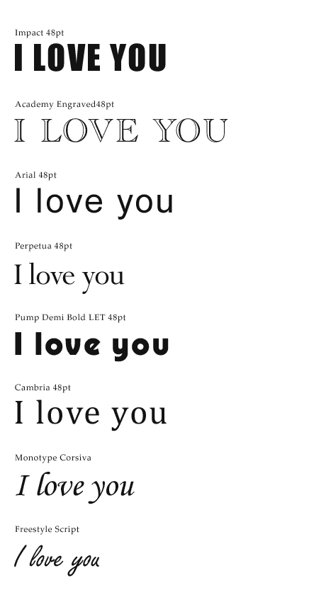
4. Tone of voice
Tone of voice is key within design. It is crucial whether an outcome is image only, text only or a combination of the two. Graphic Design is about communication between the designer and their audience. Understanding a target audience leads to generating a suitable tone of voice. If the tone is inappropriate, the impact is weak or lost. There are many ways a designer can experiment with this. Three examples are type, image and colour. Different fonts create different connotations. A script font suggests elegance and romance whereas a block font may suggest power and noise.

Tone of voice in context: Innocent Smoothie Drinks

5. Scale - chose the right file format
When working digitally, it is important to ensure you are working in the right format. This also means that your chosen images need to be the right resolution for print, not on-screen. It is common that images appear to be the correct size until it is too late. To avoid this issue, make sure you are aware of the image size and resolution. For print, images must be a minimum of 300dpi (dots per inch). on-screen, images are usually no bigger than 72dpi. This can cause an image to appear ideal onscreen, yet once viewed to scale, it becomes pixelated and blurry.
6. Resources
There are many ways to access examples of design both old and new. A few important books to read include:
-Graphic Design: User's Manual - Shaugnessy
-Fundamentals of Graphic Design - Ambrose
-Fundamentals of Typography - Ambrose
-What is Graphic Design? - Newark
Key websites/blogs to look at:
-www.creativereview.co.uk
-www.designweek.co.uk
7. Key Typefaces
Helvetica. Futura. Gill Sans. Bodoni. Times New Roman. Comic Sans
8. Research
9. Defining Typeface Characteristics.
There is a vast range of ways to differentiate between different typefaces. Each font has its own qualities and attributes. Some examples include:
- Serif
- Sans Serif
- Handwritten
- Typewriter
- Modern
- Traditional
- Western
- Caligraphy
- Rounded
- Archaic
- Cropped
- Contemporary
- Digital
- Script
- Decorative
- Bold
- Light
- Free
- Expressive
- Retro
- Futuristic
10. "It doesn't matter in what order the letters in a word are, the only important thing is that the first and last letters are in the right place"- Cambridge University Study
No comments:
Post a Comment