1. an abstract idea.
2. A plan or intention
3. An idea or intention to help sell or publicise a commodity
After a short introduction to 'what is a concept' we were put into groups and and asked to choose four words at random from a jar. One of these words was a place such as bar or hotel. This would determine the place we would form our concept around. The following three words were nouns or objects.
Our key word was hotel.
Our three words were match, staple and cloud.
We then generated three brainstorms: one for each word.
Once we felt we had covered all of the different associations of each word, we needed to choose one of the three to stick with. As a group we agreed that cloud was the most appropriate word to use alongside hotel. The initial reasons for this seemed obvious; an extremely comfortable hotel. We also liked the idea of using play on words for known phrases such as 'every cloud has a silver lining'. This was a useful positive metaphor which could also be incorporated into our design colour scheme. For example, adding a hint of silver to all of our promotional media and also hotel interior.
The key terms we came up with for cloud were: purity, comfort, dreams, sky and floating. These words all came together to form our initial concept of how our hotel would function. This also helped to form the basis of our target audience, the purpose our our hotel and the approach we wanted to take in creating the design and ethos.
We then continued to brainstorm potential guests/clients to consider as our target audience. The list consisted of:
-Arena Goers
-Celebrities
-Royals
-Rich people
-Weddings
-Religious Functions
-General Travel - backpackers
-People who are lost
-Weekend Shoppers
-Business Men
-Concert/Gig Goers
-Birthday/Hen/Stag Celebrations
-Tourists - international/national
-Football/Rugby fans
-Families - Kids at uni
From the list shown above we agreed it would be most appropriate to aim our concept towards Celebrities, Business Professionals, Rich People, Weddings and Business Men. This began to form a stronger sense of identity for the hotel. We agreed it would be a high-end, modern and luxury space for wealthy people.
Referring back to our key terms, we began thinking about our colour scheme. In order to ensure a minimalistic, sophisticated and modern identity we agreed we only needed a maximum of four colours. To focus on the colours of clouds, sky and vapour we decided it was most appropriate to work with white, ice/very pale blue, grey, with a small element of silver to represent 'silver lining'.
As we were becoming more confident about our audience and identity we began thinking about how we wanted our hotel to function. We created a new brainstorm of the facilities we wanted to include in our hotel:
-Silver service (in relation to the 'silver lining' concept)
-Gym offering Personal Trainers
-Pool (cloud shaped)
-Classy Bar
-Balcony / observation area with telescope
-O2 Bar
-Relaxed atmousphere
-Politeness/ manners
-Elegance
-Quality
-High Security
-Comfort -- memory foam beds, comfy slippers and robes
-Luxury
-Clouded glass floors
-Spa offering Turkish cloud massages
-Personal jacuzzi baths
-Fine dining
-Egyptian Cotton
We carried out some image research in order to grasp a better idea of how our hotel would look.
Next task was to come up with an ideal name for our hotel. We wanted to use something with reference to clouds without being to obvious. We thought of a range such as 'Silver Lining Hotel, Hotel Shade, Cloud 9 Hotel, Atmosphere hotel and Hotel Stratus. Our final choice was to stick with Hotel Stratus. The name stratus came from the Stratus Cloud. An example of a stratus cloud is shown below. We thought this sounded professional, memorable and sophisticated but also used the reference to clouds that we were hoping for.
Image: Status clouds over a bridge
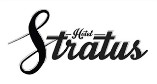
We continued to experiment with different logo ideas. Eventually we agreed the most appropriate was a combination of Roxie and Danielles designs. We liked the fact that the Capital S could also be seen as a Capital H when rotated slightly clockwise. This was ideal as it worked as a name but also a logo on its own standing for Hotel Stratus. Roxie created a digital version of the logo in Illustrator shown below.


No comments:
Post a Comment