The key features were:
-it uses two colour variations: black/red -- the red signifies danger. It also has a loose reference to 'Red Blooded Americans'.-Futuristic letterforms
-Rounded letterforms suggest 'Aerodynamic' concept. This could also represent shuttle tubing and space walks.
-The 'A' ans 'S' are connected to form a sense of 'flowing'. It also stands for 'Astronauts in Space or Astronaut Shuttle.
-The NASA logo was re-branded because it became associated with the big accident and death.
_________________________
ELLEN
_____________
1. Apple
-well-recognised
-modern sans-serif font
-good balance of formal/informal tone of voice - appealing to a wider range of people
-not too corporate
-approachable to a wide audience
2. Liz Earl
-natural themed logo
-clear emphasis on on neutral/ natural ideas
-fresh and clinical
-nature and scientific elements
3. OGIO Wine


-use of product over colour
-very clear type
-the O shape is used as a function and logo combined
-slanted edge at the bottom symbolises movement and maturity
-speaks for itself with colour
4. Next


-black & white - colour coding for different departments e.g green for garden.
-modern sans-serif font
-basic
-friendly and approachable logo
-new design, more modern and improvement from the original
5.Bagel Nash

-image & type
-rounded font - emphasises the concept of a rounded bagel
-sans-serif font creates a friendly and approachable tone of voice
LAURA
_____________
1. All Saints
-unique, vintage and authentic
-decorative font
-SPITALFIELDS is subtle
-grundgey warehouse feel
-industrial
2. Jo Malone

-self-created business after she suffered from breast cancer
-minimal black logo on cream-coloured stock -- suggests sophistication
-selling a range of feminine products
-London wealth feel - luxurious
3. The Botanist


-'botanist' floral and and decorative
-garden theme - similar to the decorative style used inside the bar itself
-natural and elegant
-organic
4. Elemis
-scientific and clinical
-'E' uses a subtle symbol/ reference of flowing water
-element of trust with the use of frosted glass on product packaging
-frosted glass also resembles steam (steam rooms)
5. Chloe
-elegant & feminine
-use of gold is sophisticated
SARAH H
_____________
1. Yoobi Sushi Bar
-modern sushi bar
-healthy green logo
-consistent use of triangles for logo, packaging and interior design
2. Snog Frozen Yoghurt


-fun, young and approachable concept
-'snog' - play on words
-aimed at teenagers
-informal & modern and unique branding approach
3. Four Seasons
-not intended to be comfortable
-very masculine
-corporate blue and grey colour scheme
4. Clerkenwell Green Events Company

-eco-friendly logo
-down to earth
-friendly
5. Grow London
-'grow your own event'
-cosmo
-aimed towards young people
HARRISON
_____________
1. Panam
-"difined driving ambition"
-blue globe
-parabolic lines
2. Elephant and Castle Shopping Centre
-negative space
-clever imagery
-elephant and a castle
3. NASA
4. Guild Food Writers
-negative space
-minimalistic
-spoon within a fountain pen nib
-designed for a company who write reviews on food
PRI
_____________
1. Puma
-sports brand
-suitable for both day and night
-puma jumping over the logo shows power and strength
-good strong balance of type and image
-use of sans-serif font shows sense of flow
2. Twinnings
-sophisticated and established
-heritage
-sometimes used in gold
-aimed towards an older mark
-patriotic British feel
3. Sony VAIO
-analogue & digital symbolism within the logo as shown above
-dot added to the 'A' as a crossbar
4. BRAUN


-dot added to the 'A' as a crossbar
4. BRAUN
-ratio of one-to-one -- fits nicely on a wide range of products
-range of upper and lower case type -- creates a unique and identifiable look/identity
5. Kandoo
-fun and young connotations 'you can do it too, with Kandoo'.
-male and female colour scheme (green and purple) - not as stereotypcal as the use of pink/blue
-playful frog-like typeface -- resembles the from mascot used on Kandoo packaging & advertising
JOE
_____________
1. Hutchins Center for African & African American Reseach

-multiple use of A's shown in the logo.
-symbolises Harvard
-researching law and crime
2. Butcher Shop
-etching is traditional
-old-fashioned connotations
-bold use of red symbolises blood and theres an emphasis on 'fresh with the image of a pig
3. NBC Broadcasting
-different colours are universal and diverse
-unusual colour choice at the time
-colour coded themes within the general logo branding
-stands for National Broadcasting Corporation
4. Belle Ninon


-sophistication and French class
-elegant
-similar design concepts to Jo Malone
-suggests feminine wealth
-Paris
5. National Geographic
-captures a moment
-yellow box is well-recognised
-snapshot varieties
SARAH B
_____________


1. Up
-management consultancy firm
-similar to graffiti style
2. Bar Code
-cheesy but fun word play/ imagery with pint glass
3. Wave

-looks like a wave
-flowing connotation
4. Knife

-cleverly designed logo - like its been sliced leaving knife carvings
5. Horror Films

____________
For next week:
-Find out a minimum of 1 logo presented in today's session. Choose one which you found particularly interesting and carry out thorough research into the ideas and intentions behind the logo design.
-Find out the intensions of the designer and the design.. was this achieved/ successful?
Apple
Useful Links
1976
The first Apple logo was designed in 1976 by Ronald Wayne, sometimes referred to as the third co-founder of Apple. The logo depicts Isaac Newton sitting under a tree, an apple dangling precipitously above his head. The phrase on the outside border reads, “Newton… A Mind Forever Voyaging Through Strange Seas of Thought … Alone.”
1977 - 1998
Rob Janoff created a new rainbow logo.
Steve Jobs is rumoured to have insisted on using a colourful logo to 'humanize' the company. According to Janoff, there was no particular reason for the colour order, other than placing green at the top as this is where the leaf is. The multicoloured logo was used for 22 years before Steve Jobs requested a new look. This was then replaced by a more modern monochrome logo variation which has taken a variety of sizes and colours over the past few years. However the general overall shape has remained the same for 33 years.
1998
Translucent Version

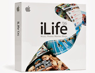
1998 - late 2000s
This monochrome version of the logo still appears on certain products in various colours, such as iLife packaging. This simplified recreation of the logo was intended to be used to a slightly larger scale than the previous rainbow variation. It also became obvious to Steve Jobs that with the advance in technology, a rainbow logo would have looked less appealing on metal computers. Older computers were built with a plastic, beige material. This worked well with a rainbow logo, however started to look outdated and cheap compared to monochrome designs.

2001 - 2007
Stylized logo variation
No comments:
Post a Comment